derp.
The end of colors
Published by Vlasta on November 5th 2012.
There is one thing every image editor has - a color picker. In a lot of cases, it occupies a premium place in the application window and is always visible. But here is a curious observation: the older the image editor, the smaller the color picker.
While Photoshop and GIMP have tiny color pickers (relative to the typical window size), younger image editors have more prominent color picker panels. Why is that? Maybe because the older image editors are more complex, need to present more options to the user and there is only so much space?
The real reason why older image editors have smaller color pickers may be quite different. Perhaps it is because having a global color picker is wrong. Perhaps the developers know that, but are not brave enough to remove it from their applications. Well, I am not, the end of the 'Colors' panel in RW apps has come.
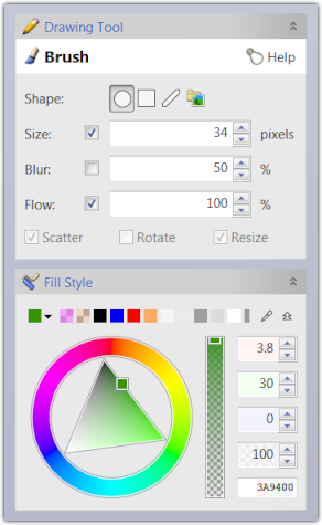
The side panel - in upcoming and current RWPaint
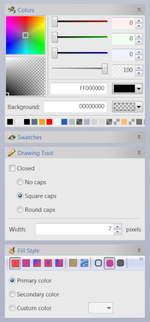
 Side panel in future version. |  Side panel in current version. |
The left image above show the side bar in the future version of RWPaint while the Brush tool is active. Note that there are just 2 panels: Brush configuration and the new color picker, currently in its expanded form.
Compare it with the right image displaying the side bar as it looks in the current version. The side bar contains more panels with much more controls. Some of these controls can be used even if they have no effect on the currently selected tool. For example, you can modify the 'Background' color, which is not used by the Brush tool.
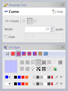
Simplification is always nice, but you may argue that the global color picker is still there. OK, look what happens when I switch to the Curve tool and to the Pattern fill style:

The 'Fill style' panel has changed significantly. First, because the Curve tool can use non-trivial styles (like gradients) for filling, there is now a list of available fill styles with the Pattern fill selected. Under that is a list of preset patterns and finally 2 color pickers (in their collapsed format - you can expand one or both of them as you prefer). Because the stock pattern needs 2 colors (for foreground and background), there are 2 equal color pickers. These color pickers are independent from the one used for solid color filling.
Gradient fill styles work similarly. A gradient may have arbitrary number colors and uses its own color picker.
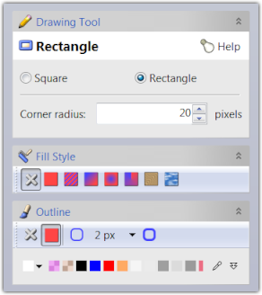
If you are still not convinced that this change is worth all the trouble, let me give you one more example:

The image above shows the sidebar as it looks when the Rectangle tool is set to draw white rectangle outlines 2 pixels wide. When you select a tool that supports both interior filling and outline drawing, a 3rd panel called 'Outline' appears.
I hope, the image is self-explanatory, but let's look at the elements. In the 'Fill style' panel, the 'None' fill is selected, which means that the interior of the rectangle will not be filled. If I wanted to fill it, I would select one of the other available fill styles. In the 'Outline' panel, a Solid outline with width of 2px is selected. Inside the panel is a color picker, currently in its collapsed state with white color active.
RealWorld Paint has supported outlines and fills for a long time, but setting things up was pretty click-intensive. I hope that this change will finally enable this feature to be more widely used.
Getting philosophical
Why does virtually every image editor author insist that there is an always visible, always active color picker? It kind of makes sense for very simple image editors, but once the image editor has to deal with outlines, patterns or gradients, it quickly starts being a pain.
Color picker has no influence whatsoever when using tools like magic wand, lasso selection, crop, liquify, red-eye remover, clone, or move. Should it still be visible when one of these tools is active? I vote for NO and I wonder how many image editors will abandon the concept of global color in the future.
 Recent comments
Good idea about independent "recently used" lists of colors for each tool. The only thing I would suggest is to have an easy way to pick the last color from the last tool used, but I'm assuming you already though of that. I only quickly skimmed the post so don't know the answer to that.
![]()
c